Market Map
Read the market tiles, choose a comparison, filter the map, and open a listing for closer analysis.
Market Map is a visual overview of several instruments. Each rectangle is a listing, with its own market type and provider. Tile size, color, and printed value are separate choices: a large tile does not automatically mean a large price rise.
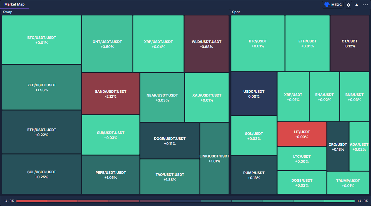
In this view, the labels distinguish spot pairs from perpetual contracts such as BTC/USDT:USDT. The percentage printed below a symbol is its reported change. The provider is selected at the upper right, next to the map's gear. The segmented scale runs along the bottom.
Open a map and choose the listings
- Click PANELS, left of the workspace tabs, and choose Market Map. Add and organize panels shows the picker.
- Click the provider button in the panel header and select the source you want to compare.
- Click the adjacent gear, whose tooltip is Map settings.
- Use the search field to match a symbol, base asset, quote currency, or exchange. Select the market types you want, such as Spot or Swap.
- Set Symbols to the desired number of tiles, then click APPLY. The range is 10–120; fewer tiles leave more room for labels.
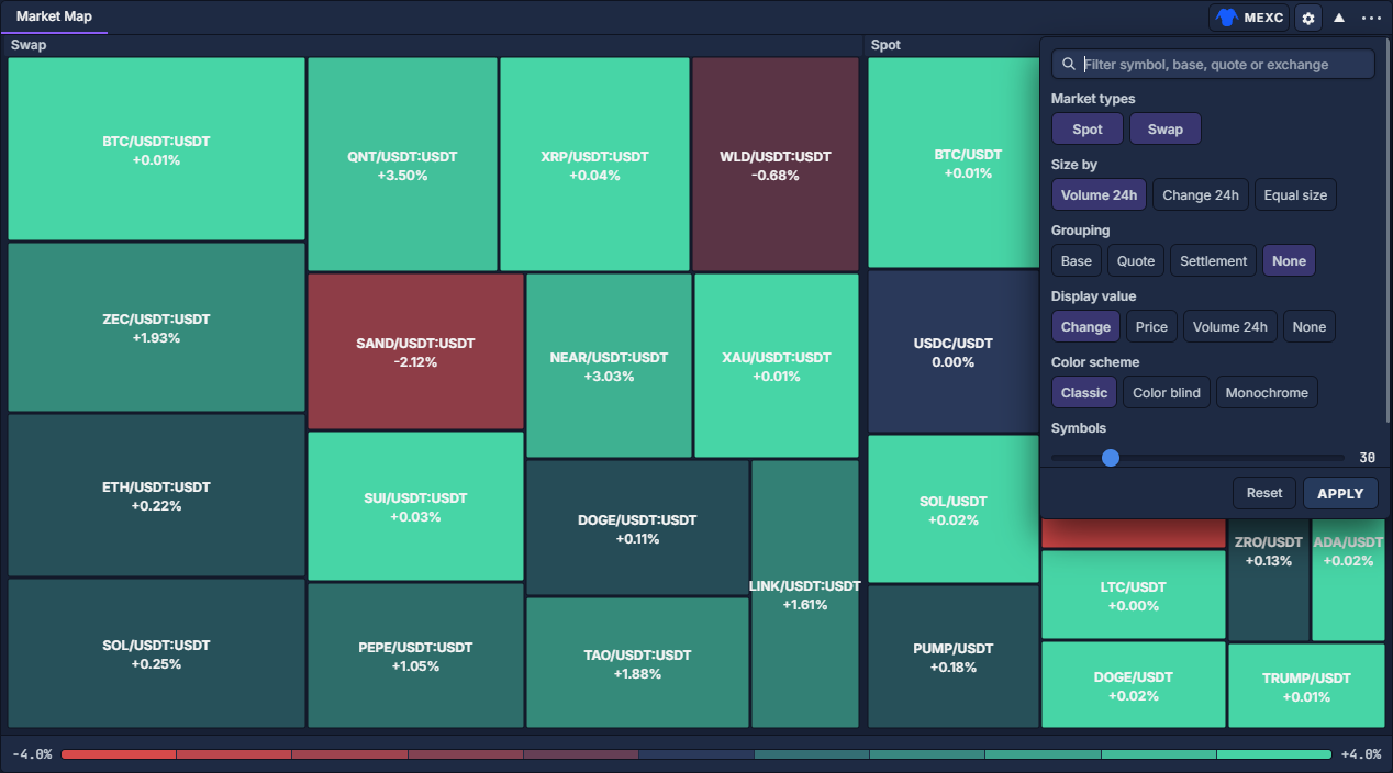
Decide what size and text should show
Sizes provide a relative visual comparison. Use the tooltip for the actual quantity; do not calculate exact turnover ratios from rectangle areas. Reset restores the settings draft to its defaults; click APPLY to use it.
Inspect and filter the tiles
Hover a tile to see its full symbol, market type, exchange, last price, change, 24-hour volume, and update age when supplied. This is useful when a small tile abbreviates its label. Keep volume units and currencies in mind when comparing instruments.
Hover a segment of the bottom legend to emphasize markets in that change range. Click a segment to hide that range; click it again to include it. When segments are hidden, the legend's Reset restores them. This is separate from resetting the map settings.
Click a group heading to focus on that group. Use the map's back control to return to the broader view. Right-click an instrument tile to open its market actions, including Chart, Orderbook, Order Entry, Symbol Info, and alert creation. Double-clicking a tile opens an order dialog; it does not submit the order by itself.
Example: compare movement without size dominating
Select one provider, open Map settings, choose one market type and a common quote currency through the search, set Equal size, and keep Display value → Change. Click APPLY. Compare the signed percentages, hover an interesting tile for its details, then right-click it and open Chart to examine how the move developed.
Chart: navigation, controls and settings · Orderbook · Symbol Info · Alerts