Chart volume and depth tools
Read footprints, profiles, statistics, recorded depth and a candle’s executions.
Footprints and volume profiles describe completed executions. Orderbook and the depth heatmap describe resting orders. TPO measures time at price and has its own guide, TPO: reading and working with a profile. Choose the view that answers your question before changing its colors or layout.
Open the analysis controls
- Open a Chart and select an instrument with the required market data.
- Click Lower toolbar at the far right of the chart’s upper toolbar if the bottom analysis row is hidden. Chart: navigation, controls and settings shows its location.
- Click a labelled control along the bottom, then enable the feature in its popup. Step Profile has a separate switch for each profile. T&S opens its sidebar directly.
- Close the popup by clicking its control again. Zoom until cells and values have room; changing the display does not fill missing source history.
Footprint: look inside a candle
Each column is one candle; each row groups executions at a price. In this example, Double / Cluster shows the trade count on the left and volume on the right. The right cells use delta coloring: green for positive buying-minus-selling volume, red for negative. The lower four statistic rows are Volume, Delta, Buy volume and Sell volume.
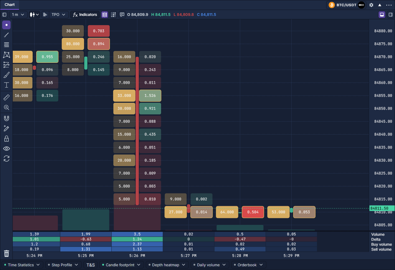
Open Candle footprint on the bottom row, or header gear → Footprint. Single uses the Right Side settings; Double uses both sides. Histogram varies bar length, while Cluster uses cells. Each side independently selects Data type, Coloring source and Text display. Volume, Trades and average-size metrics answer different questions; average size is volume divided by trade count, not order-book quantity.
Set Price aggregation → Fixed → Ticks per row to combine native ticks. Here, 50 ticks × 0.1 equals a 5-unit price row. Automatic chooses grouping for the available space. Per bar proportions emphasize each candle’s own largest row; Visible range compares displayed candles, Loaded chart uses loaded history, and Custom uses your scale maximum.
For a readable first setup, use Double, Cluster, Fixed grouping and Show text; zoom in, then adjust grouping once. POC highlights the largest row for its metric. Secondary POC, zero values, opacity, decimals and compact/scientific formatting are display choices. Automatic detail reduction can hide dense detail when zoomed out. A candle without a footprint may lack execution detail; it is not automatically a zero-volume candle.
Profiles: compare activity across prices
The example below combines Daily volume at the left, 15-minute Step Profiles across the plot, and the current Orderbook at the right. The first two summarize traded volume. The right-hand red/green bars are quantities still resting in the book.
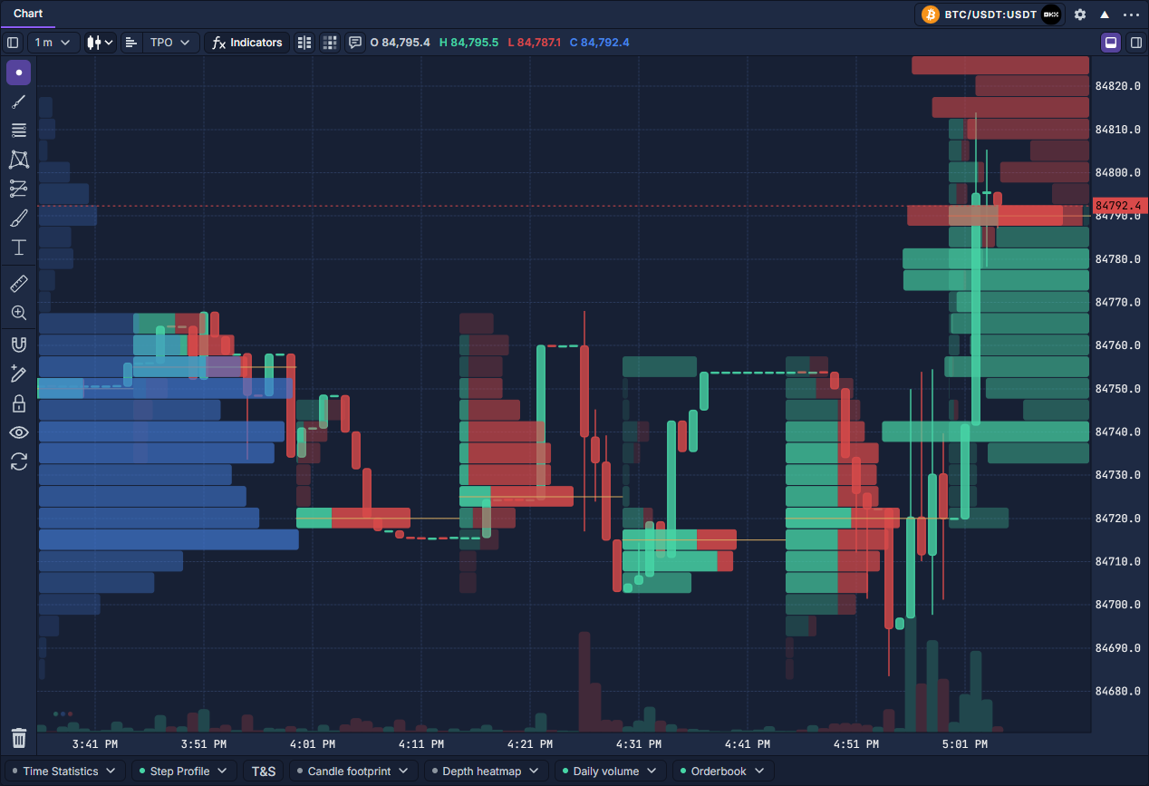
For Step Profile, enable a slot, choose its metric, then set a multiplier and Minute, Hour, Day, Week or Month. There are five independent slots. The slot’s gear opens width, direction, values, coloring, histogram, POC, POC extension, value area and totals. A Session offset shifts the grouping boundary by minutes from UTC midnight; weeks begin Monday. This is separate from the local-time daily overlay.
A volume POC is the price row with most volume. Value area expands around the selected POC to include the chosen share of volume, 70% by default; it is not 70% of the price range. Filter size affects filtered-volume metrics rather than hiding every smaller row. Start with one volume profile before comparing several metrics.
Daily volume uses the available chart data for the current local calendar day. Its popup sets left/right placement, width, opacity and values. It is not a promise of a complete day when history is incomplete. Orderbook sets width, opacity, values, minimum size and depth; depth 0 uses the available depth, while a positive value limits levels per side.
Time Statistics: compare candles numerically
Enable Time Statistics, select the rows and turn on Show values. Zoom in if numbers do not fit. Volume is total executed quantity; Delta is buy minus sell volume; Delta % divides that difference by total volume. Buy/Sell % show each side’s share. Trades, average size and maximum trade size describe execution records. Cumulative delta adds delta across the available history.
Set Filter size before selecting filtered-volume rows. Color controls apply to ordinary rows; delta rows use directional colors. ≈ identifies estimates, while — means the metric is not available. Counts, maxima and size filters need execution detail and cannot be recovered from OHLC alone.
Depth heatmap: follow resting liquidity
Click the grid-shaped heatmap icon next to footprint in the upper toolbar. Open Depth heatmap below for preferences. The background records observed depth through time; brighter or stronger colors indicate larger quantities under the chosen scale.
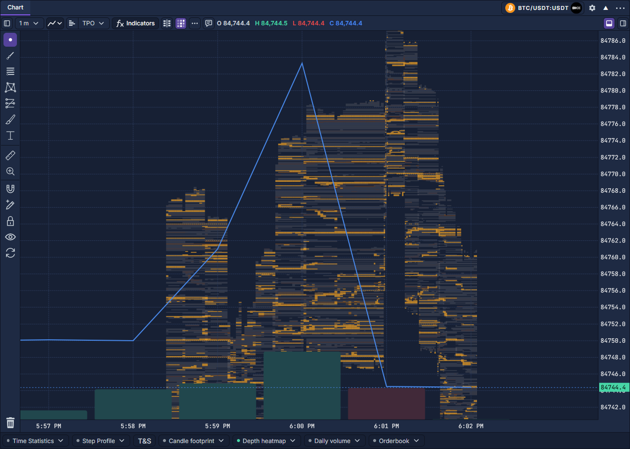
Use Time columns to choose continuous intervals or chart-bar alignment. Latest observed retains the last snapshot in a column; Maximum observed retains each level’s peak, potentially from different moments. Levels per side and the column limit control coverage. History begins when recording starts; older blank space is not proof that the book was empty.
Palette, contrast, opacity and custom scale maximum control readability. Minimum quantity filters small depth; the upper threshold highlights large depth. Optional best bid/ask lines, values and the inspection magnifier help read a level. Resting orders can change or cancel, so a bright band is not a completed execution. SmartDOM: footprint, tape and depth shows this layer beside a live ladder.
Historical T&S: inspect one candle’s trades
- Click T&S on the lower toolbar, then Bar Select at the top of the sidebar.
- Click a completed candle. Its start time appears above the table; rows show Last, Size, Aggressor, Tick direction and Time.
- Compare Aggressor with Tick direction: buying/selling classification and movement versus the preceding price are different facts. A dash means direction could not be established.
- Turn Bar Select off to navigate normally while keeping the table. Right-click a table row or header and choose Clear table to clear the selection. Changing instrument or timeframe also clears it.
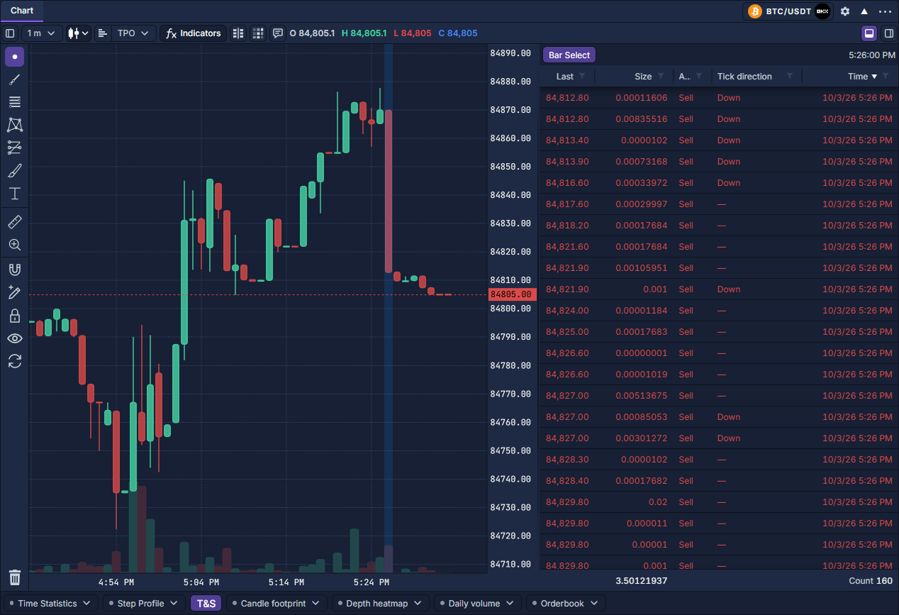
This table is a requested historical interval, not the continuously updating Time & Sales panel. Re-select an open candle to refresh its interval. Sorting, filtering and columns use Work with data grids; the footer summarizes the supplied records and size.